Tuesday, 24 June 2014

A view from the bridge


Today's Guardian questions the wisdom of Thomas Heatherwick's garden bridge project, which has now been submitted for planning permission.

Though anyone who stands in the way of a project that has Joanna Lumley's support has to think carefully, not least because you may have the gurkhas to contend with, I share the view that the undoubtedly multi-talented Heatherwick is overreaching this time.

The proposed location - South Bank to Temple - is not a bad one (the 1944 Abercrombie plan suggested a bridge here).  But does a new bridge need a new design?


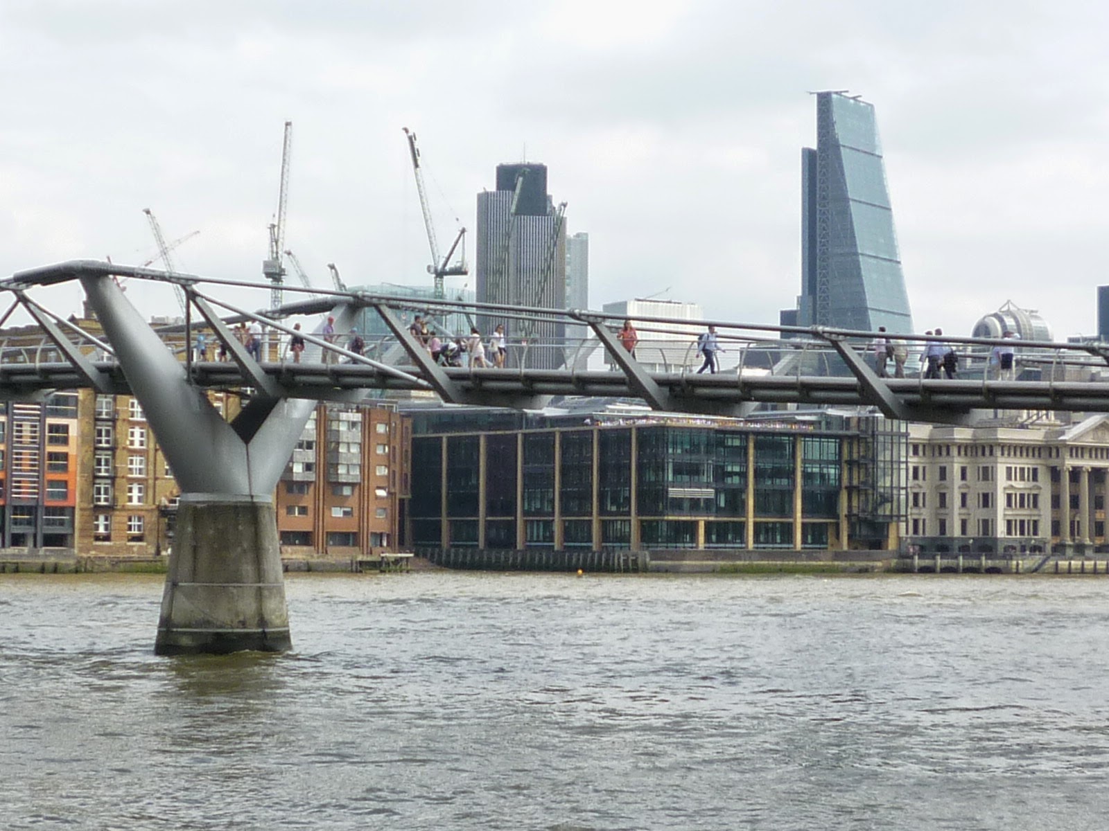
The Millennium Bridge opposite Tate Modern does the job well, now that the wobbling has been sorted out, and is as elegant a structure as any that emerged from the boom years of lottery projects - its deck structure is almost unbelievably slender from some angles.  The design approach evokes, more evidently than some other Foster projects of recent decades, the pre-peerage Norman Foster's interests in economy of means, and in Buckminster Fuller's associated question 'how much does your building weigh?' - also brought to mind by a BBC documentary yesterday about tents and tent structures, in which Frei Otto (still with us, and entirely lucid, at age 89) reminded us of a recent past where there was a great deal more optimism about the future.  Heatherwick's heavyweight, loam-freighted offering, by contrast, has something of the folie de grandeur: more Decline and Fall of the Roman Empire than Tomorrow's World.

There are other places in central London where a new Thames footbridge could usefully be provided - most notably, Nine Elms to Pimlico.  Why not dust off those Foster and Arup drawings and build a couple more Millennium Bridges? Like the Georgian house and unlike Mr Gove's schools, if it's a great idea it will bear repetition.

Heatherwick's bridge will offer good views, undoubtedly, but it will block other views that we enjoy already - that's why the pigeon's eye view, as seen in the Guardian, is preferred by the promoters.


The new Blackfriars station where it crosses the river, above, shows what can happen - from points on the south bank of the river, the low-rise nirvana of the City of Westminster to the west is blotted out almost entirely.

This just at a time when those promoting the putative 'skyline commission' for London are suggesting that the open quality of the central London reaches of the Thames should be protected from further encroachment. Large trees in the middle of the river will encroach on it a lot more than a few tall buildings in the backdrop.

But Heatherwick and Lumley have the advantage that the English prefer trees to buildings, even in the heart of their metropolis.


Monday, 7 April 2014

Olympic Park revisited


Off to see the Olympic Park, on the weekend that the south part of the park opens to the public on completion of the work that transformed it from 'games mode' to 'legacy mode'.

There is plenty to admire and a few things to carp about, but in general terms the two most striking aspects of what has been achieved are (1) the fact that it has happened at all, and (2) the fact that it has been carefully designed and properly funded, with no obvious signs of 'value engineering' (but neither is there pointless extravagance).

With London under huge pressure to grow within its borders, it is very hard to find opportunities for new open space of any size, let alone such a large expanse as this - and it only happened here because of the enormous funding made available to clean up a century's worth of pollution, ill considered infrastructure and then neglect over much of this area - which in turn only happened because of the Olympics, but which has delivered a major public asset in a place where it is needed, and effectively in perpetuity, in a way that has not often been achieved as a result of Olympic games elsewhere.  Compare the scale of what has happened here with the open space on offer in other regeneration areas - usually at best a 'linear park', for which read a slightly wider than usual street with some shrubs in it.

My principal general criticism of the approach taken here to the design of the new park is that it appears over-programmed and over-designed, with not enough space left as simple expanses of grass and trees available for quiet enjoyment (and relatively cheap to maintain) - a mistake avoided at one of the first and still one of the best of a new wave of 'regeneration parks', the Parc Andre Citroen in Paris, where the more complicated and programmed elements are arranged around a big lawn.   At the Olympic Park it feels as if they have put too much thought into just what kind of fun you ought to be having.


It is pleasing to see Zaha Hadid's Aquatics Centre as it was meant to be seen at last, without the bingo wings that it displayed during the games. The nearby helter skelter - presumably, I hope, temporary - did make me wonder at first why she couldn't have been persuaded to turn her hand to a version of this funfair attraction.. But when you compare her Aquatics Centre with Hopkins Architects' Velodrome, you can see that it is they who should have been asked to handle the pure geometry of the helter-skelter; Hadid would be your choice for the Big Dipper.  Horses for courses is an important subject in architect selection.

It was disappointing to find that while the roads through the park, some quite busy, have been engineered in the modern, enlightened, pedestrian-friendly manner, with no barriers and straight line crossings, one finds as one gets close to the Westfield shopping centre to the east of the park that things change within the space of a few metres.  Here one finds oneself in a zone where a completely different set of old-school highways rules have been applied, with a forest of posts and clutter denser and more instantly mature than any of the new planting in the park could hope to be - and the pedestrian relegated to second class citizen, as they used to be.


Wednesday, 2 April 2014

Sense of PLACE at the Grosvenor Estate, Page Street


'Place' is meant to be important now - so important that it has been promoted to capital letters in the Farrell review.

But the endless blethering about 'sense of place' that fills today's planning documents can be tiring, because no one is able go on to explain what on earth it might be - or, for example, how you could hope to provide it in a new social housing scheme.

There's no question that it's important, though.  And you know it when you see it.

One of the weirdest housing developments in London can be found at Lutyens' Grosvenor Estate housing around Page Street in Westminster, only 500m or so from Parliament.  Weird and wonderful, that is.  Built in 1929-35, well into Lutyens later, more classical / imperial phase, it provides one of the most surreal streetscapes in London.  Long, repetitive, parallel U-shaped blocks, end on to the street, have deck access around the three inner faces. The surreal quality comes from the combination of severe repetition of the blocks themselves and of the chequerboard pattern applied to their outer faces.

Between the wings of housing along the street frontages are elegant single storey pavilions, containing shops and other facilities; these are given fancy classical detailing that is largely absent from the housing itself, a nice touch  - while such embellishments might have been pompous on the housing, they are charming on the pavilions, elevating them several notches above the mundane  - and rendering them just about strong enough to accommodate the exigencies of later commercial signage...


Spend some time here on a quiet, sunny day - or even a rainy one - and you can experience at least one example of how a sense of place has been achieved.

It probably won't help you achieve it anywhere else, though.

Friday, 7 March 2014

The Campaign for Better Elevations

The dozens of consultants appointed to take part in the design of a major project now include 'facade specialists', but these people don't presume to design the look of the elevations - that is one of the few jobs still left to the architect.

However, a quick walk round many new developments suggests that some architects aren't much good at designing elevations. I don't offer any examples, but you can picture your own at this point.

Is there a need for a new specialism?


The handsome immeuble Lavirotte (or immeuble d'Alexandre Bigot) in Avenue Rapp (two great names there), in Paris near the Eiffel Tower, has a sign explaining that it won 'le prix des facades de la Ville de Paris' in 1903.


The design of elevations was also taken seriously as a discipline in its own right in London in the first part of the twentieth century.  In the Survey of London one can find two typical examples of interwar buildings in Mayfair getting facade upgrades at the request of the Grosvenor Estate, presumably because the original architects weren't thought quite up to the standard that the estate saw as appropriate.  At no. 8 Upper Grosvenor Street, the design for a 1920s refronting of the elevation in stone was taken out of the hands of the leaseholder's architects and given to the Estate's consultant Sir Edwin Lutyens...


...and on the other side of the street, the elevation of a block of flats being put up by Messrs Edifis Limited of Pimlico (yet another great name - aren't they in the Honeywood file?) was taken by the Estate out of the hands of the builder's jobbing architect and given to establishment architects Wimperis, Simpson and Guthrie.


Today, when architects have 'value engineering' attack dogs set on them the morning after the planning consent is granted, we get dumbing down, rather than this patrician sounding smartening-up.  But for many central London projects, the front elevation of a new building between party walls is the only important outward and visible aspect - one that is often got terribly wrong, as the architects' waking hours are dedicated to optimising the core layout rather than fine tuning the window proportions.

Of course architecture is more than elevations. But elevations are all the public get to see or care about with many buildings, and they deserve more attention than they get.

The Campaign for Better Elevations needs a prize sponsor.

Monday, 10 February 2014

Still waiting for the modern world


Saturday's Guardian profile of EH boss Simon 'It's absolute nonsense to say that I'm a fogey!' Thurley notes that his new book The Building of England has been criticised for ending at 1940, and cites The Times's Richard Morrison's claim that 'he stops his survey after 1930...but most of us live and work in an England built since then.'

Which made me wonder whether (depending on who the 'us' in 'most of us' might be) the latter claim is in fact true.

There must be a date such that half the buildings in the country were built before that year, and half after.  What is that date?  Quite a lot was built during the 1930s - for example major suburban extensions to many towns and cities - and my guess is that the answer lies around 1930-1940 - certainly a significant amount of the country's building stock is from the interwar period.

But there are many places where you see very few buildings built since the Second World War; and many small towns and villages where little has been built since the nineteenth century.  You can travel for many miles through much of England and see nothing built in your lifetime.  In such places, anything new comes as a surprise.

A 1930s building such as Peter Jones in Sloane Square (pictured above) might, according to my estimate, sit in around the fiftieth percentile of buildings by age.  But it still looks strikingly 'modern', and would be described as such by many (and might still struggle to find favour with Kensington and Chelsea's planning committee if put forward as a new project today - too big, out of character with its heritage setting, untested young architect, monotonous curtain walling, surely Chelsea deserves better than this drone drone etc etc).

The proportion of buildings in most parts of the metropolis, let alone elsewhere, that look 'modern', is still very small.   To architects, designing a 'modern' building is to conform to a model that has existed for about a hundred years or so; but to civilians, such buildings are still not seen as the norm, because the pace of change is so slow; and 'modernism' is still seen by many as a foreign import, as it has been ever since it appeared.  Classicism was a foreign import too, but like the Normans and then the Saxe-Coburg-Gothas, it has been around long enough to have been accepted. Modernist projects today can find themselves subject to the xenophobic, or worse, 'you're not from round these parts, are you?' strain of thinking that can still be found all over England (admirers of John Landis' An American Werewolf in London (1981) will recall the scene set in the Slaughtered Lamb).

But the pace of change in the world of 'heritage protection' has been quite different.  While the idea of listing postwar buildings was seen as pretty controversial only two or three decades ago, now almost anything built more than thirty years ago must be fretted over as a potential 'heritage asset' (neither word in this ghastly but cunning term was used in relation to old buildings a few decades ago - they were just old buildings, the best of which were listed).

There is very little evidence of popular interest in preserving postwar buildings - the attendees at an average Twentieth Century Society meeting are a bit, well, specialist - but then Georgian and Victorian architecture needing saving by zealots when it was under threat a few decades ago, and we can thank them that we still have St Pancras.  The problem is in keeping focussed on the good stuff, rather than objecting to the demolition of almost anything.  Conservation areas and listed buildings are meant - by law - to be 'special' .  If more than half of the country's building stock is, or is part of, a 'heritage asset', we are in danger of devaluing the whole thing (as paragraph 127 of the National Planning Policy Framework, for example, warns local authorities to avoid).  If it's 'modern' it might indeed be heritage; the corollary, in danger of being overlooked, is that if it's a bit old, it nevertheless might not be heritage.

The Guardian article considers these tensions between the old and new in 'heritage', and observes that Thurley, the 'ostensible fogey...is English brutalism's greatest champion'.

In this country, planning judgments about design and heritage are made in theory on the basis of policies and guidance that their promulgators like to claim are rigorous and objective, but in practice are made up on the hoof and on the basis of whimsy, and not a great deal of knowledge or sound judgement.

It is in the area of 'coming to terms with the modern' - with which the English have been struggling for about 100 years - that this is most apparent of all.

Monday, 3 February 2014

Blank looks at Debenhams in Oxford Street


A current makeover of Debenhams department store in Oxford Street involves overcladding the very dull 1960s elevations of a building described in the Pevsner guide as 'big and dispiriting' with a 'kinetic facade' of suspended aluminium panels, which are intended to ripple in the breeze.

When I walked past, there was drizzle but no breeze, and not much rippling going on - the effect was plain and static, rather than lively as indicated in the publicity - no doubt it will be better on a day that is both sunny and windy.

When a dull building that one has walked past many times has gone, it's hard to remember what it was like. The wonders of Street View (which the idle who use it for virtual site visits should always remember illustrates the recent past, not the present) show the old elevations of windows in vertical strips, alternating with strips of concrete cladding - pretty dispiriting even to a concrete enthusiast, and clearly a candidate for a makeover.

But while this project has given Debenhams a bit of bling, it's taken away the windows.  Was that such a good idea?  Many 1960s department stores that are even more dreary than the old-look Debenhams were built without windows altogether, but all of London's best stores, whether trad or modern - Harrods, Selfridges, Peter Jones - have elevations that are fully fenestrated.  Of course not much use is made of the windows, but that's not really the point - they are there just to give the illusion of the possibility of views in or out. From the outside it is generally not possible to tell whether they are used as 'real' windows or not, and I think that where you can see in through one or two windows, you are fooled into thinking you can see in through the rest. In fact, of course, windows don't generally afford much of a view into houses, flats or offices.

Windows at the upper levels make department stores into civilised, neighbourly city buildings.  You don't get sham windows on a retail park.

A city can take the odd store without windows - Birmingham's Selfridges is the highlight of an otherwise bland collection of retail buildings.  But Oxford Street has many big stores - what if they all followed suit? We know by now that form following function is not such a great precept.


Tuesday, 24 September 2013

The step-free world - can it have a downside?

Changing the built environment to allow step-free access - an exercise which is costing a huge amount of money, and if you consider London's tube network, has really only just begun - is a good thing.  I have pushed buggies and I still push a wheelchair from time to time, and the world has got better over the last few decades for the millions of us who do this.

But the move to Flatworld is not without a downside, and this doesn't seem to be discussed much.

Making the world safe for wheelchairs and buggies has also made the pavements safe for tourists with luggage on wheels that is too heavy to lift; for badly controlled infants on scooters and badly behaved adults on roller blades (and bicycles); and, in a further contribution to the continuing atrophying of human muscle power, for the Segway.

Anything that had George W Bush as a famous early adopter needs to be looked at with suspicion.


Here at Port Soller in Mallorca, for example, a huge sum of public money has been spent in recent years on public realm improvements along the waterfront.  It is all to a high standard, and as we expect of such projects now, everything is step-free.

And so a shop on the waterfront offers Segway tours - which would not have been possible before the improvements.  You get to see the waterfront, like on foot but faster, and to the irritation of pedestrians.

There are two main downsides to step free access.

First, letting onto the road anyone who has a good reason to be on wheels on the pavement - such as a wheelchair user - for example to cross a side street via dropped kerbs - has the undesirable consequence of letting anyone who should be on the road - such as a cyclist - more readily onto the pavement.  And it makes the use of things such as roller blades on pavements, not always found on the feet of considerate people, easier for those who want to do so.  The general elision of the world of the road and the world of the pavement - in principle a good thing, in the introduction of the shared surface  - encourages the take-up of new things that don't obviously belong to one or the other, like the versions of infants' scooters that are used by grown ups - some versions of which are powered.

The second, related downside is less activity for the able bodied, particularly if they are predisposed to avoid physical effort, as most of us are.  Someone in a wheelchair needs a lift to get the first floor - the able bodied don't, but they tend to use the lift anyway - and most new buildings are arranged to hide the stairs away.  Encouraging walking by improvements to the built environment is a public policy objective intended to improve health, but there are all sort of things that make it easier not to get incidental exercise, such as by climbing stairs or carrying bags, than it used to be.

While shoes with integral wheels don't seem to have caught on yet for the adult market, this may just be the result of an image problem, as so far they have mainly been aimed at children.  But that doesn't seem to put off grown-up roller bladers and skateboarders.  As it becomes more and more practical to get from home to work with wheels on your feet, the practical means will surely soon be provided for everyone to do this.  

The Incas knew about the wheel, but used it only for small objects with no practical use, like toys.  No flat surfaces to use wheels on, you see.  The Incas didn't last.  The future appears to be flat.