Friday, 11 August 2017

Making a mess of Exhibition Road

The shared surface streetscape scheme for Exhibition Road in London's museum quarter, designed by Dixon Jones and completed in 2012,  looked great when new and was hailed as a success

Now, though, it is being messed up.  First, the beautifully worked out patterned paving (constructed, it seems, on a proper sub-base, unlike the sightly, but collapsing, block paving schemes in St Martin's Lane and Cowcross Street - another lost art) began to be replaced by repairs of the messiest kind, tarmac in some places and concrete in others, according to the whim of the perpetrators...


More recently, ranks of huge new blocks of granite have been placed on top of the paving, presumably as an anti-terrorist measure...


..located according to some sort of notional plan, but only approximately, with most pieces a bit off square, not quite lining up, and not aligned with the paving pattern.  They are not fixed, but perhaps were too hard to shift once they had been unloaded.

It seems crazy to spend the money on honed granite blocks and not place them properly - better to do it in concrete, and spend the money saved on some more diligent builders - or supervisors.

You can't fight entropy, I guess.  Ordered systems inevitably become disordered.  Reading Stewart Brand's 'How Buildings Learn' should be enough for anyone to get over the idea that you can make a project perfect on day one and hope to keep it that way.  But like most architects, I hanker for a built environment that is better organised than the one we are given.  The Royal Borough of Kensington and Chelsea, of course, now have more important things to worry about - and it now looks as if the money spent on paving Exhibition Road would have been better spent on refurbishing tower blocks properly.

But here as at Grenfell Tower, this is not just about money - it is about doing things thoughtfully and carefully once the resources have been committed.

Thankfully, you can raise your eyes from the streetscape and cheer yourself up at either end of Exhibition Road, with two recent projects.

At the V&A Museum, AL_A's project to connect Exhibition Road to the central courtyard succeeds in that main objective, and as with so many public projects, it is good that it has happened at all in these straitened times -  but it is done via some odd moves along the way.  The project's new entrance courtyard shares with the practice's MAAT museum in Lisbon a white tiled paving that produces enough glare to be uncomfortable without sunglasses on a sunny day - here, it would be good to find the ravages of time taking a bit of gloss off.


Francis Kéré' s Serpentine Pavilion, at the other end of the road, is one of the best of that series - joyful but rigorous,  masterly in its control of geometry, and free of the whimsy of some of the gallery's offerings of recent years.


Serpentine pavilion architects, of course, don't have to worry about entropy - the project is taken down before it can set in.


Monday, 6 February 2017

Quality, 'quality', and fashion - the beauty of black


Usually, you'd think of granite as a high quality material for the outside of a building, and consider paint to be lower down the scale.

But in the current makeover of a tired office building next to Farringdon Station, deeply unfashionable 1980s granite cladding is being painted black - what was conceived of then as a wannabe city office (but in slightly less smart Clerkenwell) reimagined now as a wannabe Shoreditch co-working hub (but in slightly less grungy Clerkenwell).

Derwent London's sales website for the project seems to suggest some different, more complex, and dare I say more po-mo, versions of the elevational makeover; but with the scaffold now down, I'm hoping it will remain in the simpler version seen above.


There's nothing inherently cheap looking about paint - context is everything.  Nash and Cubitt put up acres of painted stucco buildings in London where they would have used stone if they could have afforded it, as the architects of Georgian Bath and Edinburgh did.  Nash's terraces are always described as stucco, but what you are actually looking at is paint*.  The result is, nevertheless, classy - partly because the paint is well maintained.

The Farringdon building, on the other hand, though granite-clad, was ghastly - 'Early Learning Centre' architecture according to Hugh Pearman - and in a post a few years ago I suggested that it was a shame that it had not been demolished when so many other buildings in the area were coming down.

I remember the architect Irena Bauman, in a talk a while back, referring to the inability of some clients to distinguish between quality and 'quality' - a magpie like fondness for shiny expensive materials, splashed all over (ironically) as if with a brush, being symptomatic.  Gold lift car interiors, anyone?

The new version of this building looks classier, to my eyes, than the old.  I can see the point of the makeover - in 2017.  But here we are really in the world of fashion and kerb appeal rather than quality vs. 'quality'.    With a reference back to some interesting Georgian buildings such as 10 Downing Street allowing architects to claim that black paint is an established part of London's rich palette of building materials, projects from Adjaye Associates' Dirty House (2002) in the East End (which may have kicked all this off) to Squire and Partners' 5 Hanover Square (2012), and now this makeover by AHMM for Derwent in Farringdon, suggest that black elevations have become the new, well, black.


*Originally, much London stucco was intended to be painted to resemble stone. According to an essay 'Stucco' by Frank Kelsall in 'Good and Proper Materials' (London Topographical Society, 1989), oil painting of stucco (as found today) had become general by the 1840s, but was probably unknown to Nash. 


Monday, 9 January 2017

RFAC 2.0 in 2017?

Older readers may remember the Royal Fine Art Commission or RFAC, the architecture quango which was abolished and replaced by CABE in 1999.  Could it now be on the way back?

The patrician ethos of the Commission, under its Chairman Lord St John of Fawsley, didn't find favour with the Cool Britannia mindset of Tony Blair's New Labour administration elected in 1997. But what goes around comes around, and so when the coalition government arrived in 2010, CABE, probably now in turn seen as a Labour oriented outfit, lost its government funding and was nearly killed off in the over-hasty 'bonfire of the quangos'.

A body called the Royal Fine Art Commission Trust has however carried on quietly since 1999.  For a few years it ran an annual architecture award, as it had when the RFAC was extant - then after the death of Lord St John in 2012, things went quiet - but it has recently been upping its profile, perhaps considering that the circumstances are right for a re-founding of the Commission.  The Trust has eminent names listed as advisers and trustees, such as former Tory minister and grandee Lord Carrington, architecture patron and developer Lord Palumbo, and Lord Foster - and for political balance, Labour MP (but a posh one) Tristram Hunt.

In November Lord Foster delivered a lecture organised by the Trust, 'Designing the Future: Starting in the North' - in Manchester Town Hall - suggesting an alignment with government 'Northern Powerhouse' policies - although as reported by the AJ, this was undermined a bit by the headline grabbing part of the talk being devoted Foster's Thames Hub scheme for an estuary airport...

And for the last year, an @RoyalFineArt Twitter account has been tweeting prolifically on things architectural and urbanistic - and significantly, with the odd hint that there might be a need for a new Royal Fine Art Commission.

Full disclosure - I worked for the RFAC and then for CABE.  Both organisations offered good advice about major project proposals - and in spite of the shift in tone and style from meetings chaired by Lord St John (until 1999) to those chaired by Paul Finch and his successors (after 1999), the content and quality of the advice given didn't change much.  Though each organisation had the odd blind spot (e.g. things royal in one case, certain 'starchitect' schemes in the other), in general terms good schemes were still good schemes, bad schemes were still bad.

CABE's role and status, in its post-2010 guise as part of Design Council CABE, are rather diminished.  The quality of advice offered is still good, but the lack of political support and the lack of public funding have considerably reduced its capacity and its influence - as has the significant growth in the number of local design review panels.

It is good for architecture if there is at least some evidence of senior politicians thinking that the subject is important.  There is no sign of this whatsoever in the present administration - the one minister considered sympathetic, Ed Vaizey, lost his job last May.  A case can be made for a strong and authoritative independent voice to speak up for architecture in national discussions - but with no minister likely to take an interest, one wonders how successful the Trust could be in reviving the RFAC to fulfil this role, if it is serious about this.  The tone of the May administration is more Rotary Club than Bullingdon Club, so from that point of view the Trust's friends in high places may not be of quite the right kind.  But before long we could have an architecture buff as our king - perhaps that is where they are setting their sights?

I scanned my copy of the RFAC's 1999 'Final Report' for a hint of an intention to return.  I could find nothing.  But considerably stranger things have happened in the last twelve months.

Monday, 28 November 2016

London's new Design Museum

London's new Design Museum, newly open to the public, is a bit of a curate's egg, to say the least. The Grade II* listed former Commonwealth Institute building, converted by John Pawson to house the new museum, now sits behind two new blocks of flats designed by OMA, which have helped fund the project.

The good bits first.  As so often, one shouldn't overlook, before moving on to the detail, what an excellent thing it is that the project has happened at all; that the Commonwealth Institute building has been rescued from redundancy (and possible demolition - remember Culture Secretary Tessa Jowell's dodgy scheme ten years ago to get a special law passed to allow this?); that the project was put in the hands of two first rate architects, OMA and John Pawson (not necessarily the right architects for the task at hand, but never mind), and has been executed to a high standard; and that the importance of design to a country trying to reinvigorate manufacturing industry gets some welcome promotion.


The project's main flaw is a fundamental one - the approach sequence for visitors, from the street to the front door, is muddled and compromised, through space carved out from under one of the blocks of flats; and the more obvious route to the retained building, between the two new blocks, is occupied by a service road leading to a loading bay - with unattractive sliding vehicle gates interrupting what is otherwise a lavish landscape scheme.  Lots of lovely materials and fine detailing - but the basic moves are a mess.  'Where to put the front door' and 'how to get to the front door' have been fundamental aspects of designing a building for ever; 'how to get the lorries in and out' is a problem that arrived more recently, but increasingly it is one that has the potential to mess things up badly if you fail to sort it out.  This project is hardly alone in getting the route to the front door wrong - where the precepts of modernism replace the language of the traditional city, this is one of the babies that often seem to go out with the bathwater.  But then Palladio etc. didn't have to design for lorries - nor did they have to put up with being told what to do by highways engineers.

Once inside, one is presented with a clear contrast between (1) the dramatic sweeping form of the original hyperbolic paraboloid roof, together with its raking support structures, with slightly rough and ready details and (2) the new museum created inside this space by Pawson, arranged as galleries around a central space which rises to the roof - all blond wood, right angles and minimal, sophisticated detailing.


To my eyes, the clarity of the underlying idea, which reinforces the contrast between old (curves, funny shapes and angles) and new (straight lines and right angles) , is undermined by diagonal lines of the strongly expressed staircases, part of the new architecture, which rise - each different and each at a different angle - through the central void.  They are clunky when compared with everything else, old and new - but very prominent.


However, at least you can see very easily how to get from one floor to another - unlike say the V+A, where you can spend a long time trying to find a staircase.  Perhaps it is unfair to criticize Pawson for prioritising function over high concept, since he is just the sort of architect who gets castigated for doing the opposite.

The Twentieth Century Society were very cross when this project came forward, claiming that it was harmful to this important mid century building.  But in a case like this, if no one is offering to sort the site out to the satisfaction of those with a purist conservation vision, surely it is better that the site should be secured in this compromised form, as they would see it, rather than running the risk of continuing decay.  When the project was at the planning stage, I had the pleasure of going round the site on a visit attended by the original architect Roger Cunliffe, and my memory is that he was far more pleased than not about the prospects for the site's future - putting the objectors, not for the first time, in a 'purer' position, with regards to conservation of a modern building, than the project's architect.

The highlight of my visit, though, was not an architectural one - it was discovering The Maker's Bill of Rights - which should be passed into law.


Tuesday, 27 September 2016

Architects' Bake Off - Biscuit or Blancmange?

The scheme for the 'Olympicopolis' project in the Olympic Park, by Allies and Morrison and others, was - along with the continuing saga of the Garden Bridge - a top architectural story of the summer silly season, when the scheme for a new cultural quarter was publicly criticised by Peter Cook and others, basically on the grounds that it is boring.

Rowan Moore's piece in the Observer, well argued as ever, described the spat as 'biscuit vs blancmange' - Cook having characterized the peddlers of the bricky New London Vernacular architecture as the 'biscuit boys'.

This was all argued out in similar terms over a decade ago, in the New Labour heyday of the lottery funded wow-factor 'icon' - the apotheosis of the debate in those days being Graham Morrison's memorable talk at the Royal Academy in 2004, with icon projects such as Will Alsop's Liverpool 'Fourth Grace' in the firing line.

Once upon a time it was obvious which were the important buildings in the city - churches, town halls on so on.  They were the most noticeable, and usually the biggest, buildings, and the best architects got to design them - the 'icons' of their day.

Now the best architects - including the ones who want to do showy buildings - don't generally get churches to do, and even cultural projects are rare - so they give us showy blocks of flats or offices.


The agents and marketing people who are tasked with shifting new office space and flats want pretty much everything to be unique, iconic - or at the very least a landmark or a gateway.

But not everything can be an eye-catching, look-at-me building.  Some architects are much more likely than others to offer you one - but did anyone except the client want one?  Some argue that in an age where consensus about anything is rare and deference is seldom found anywhere, the city is no worse for a few new eye-catchers. And certainly a city where the only things that can go ahead are those to which no one objects is not going to be a very interesting place.

But there is room for a lot more thought, and explicit discussion, at the beginning of a project concerning how far the 'look-at-me' dial is to be turned up in any particular instance.  It is a question that relates to the uses of the building and its place in the city - and the answer might influence the choice of architect, and what the brief asks them to do.

In London, where the cityscape is becoming, in places, a bit of a mess - part glorious mess, part inglorious - there is a clear need for more and better planning - in the sense of ordering the city, through spatial planning, rather than writing more and more and longer and longer documents - and for more quality control.

That means debate both about the basic question of whether building proposals are any good or not, but also questions about what form of expression is appropriate in any given situation: biscuit or blancmange, plain or fancy, straight or curvy.  Both sorts of consideration are important to the future of London's cityscape.

The Olympicopolis Bake Off affair is the reverse of the more common sort of objection that building proposals are showy when they should be quiet.  Peter Cook has a point: if you can't be a bit flash in a cultural project in a regeneration area, where can you?


Thursday, 25 February 2016

Planning (in) the digitised future

One of the suggestions made by the Skyline Campaign is that there should be better, and publicly accessible, digitised modelling of project proposals.  I don't agree with a lot of they say about tall buildings, but I do agree with this.   Citizens should be able to find out for themselves what is being put forward, and the technology exists for them to be able to see images of what it would look like from a viewpoint they are interested in.  If you can make a film like Gravity, then you can certainly make a system like that without inventing any new technology. It wouldn't be cheap, though; it raises tricky questions of open access to data; and it also makes you think about just how accessible such a system is likely to be for everyone, as opposed to  IT literate bien-pensants.  Here is a piece on this subject that I wrote for the RIBA Smart Cities programme:


If you were excited by the digital world created in Alfonso Cuaron’s Gravity, then looking up a planning application on a local authority website is likely to bring you back down to earth with even more of a bump than Sandra Bullock’s landing. What are the prospects for better and more sophisticated digitisation of the planning system?

It’s not hard to imagine amazing possibilities for spatial planning in a digitised world, given the continuing exponential growth of computing power and capacity.  The kind of imagery we are used to seeing on Time Team, with successive phases of building on a site presented digitally in ‘fast forward’ fly-throughs, could readily be applied to project proposals, and brought up, as standard, for consultees to review on a local authority website – rather than some badly drawn plans scanned at poor resolution, as we might be able to find today if we are lucky.  A dynamic digital imaging app could allow you to hold up your iPad in front of you on site and view a new scheme overlaid on reality, as it would appear from that viewpoint.

But today, it feels as if we are still in the Stone Age.  The applications suggested above wouldn’t need any technology we don’t have already (and probably exist already in some form) - but they are not very likely to become standard practice soon.  The reality is that digitisation of the planning system is in its infancy – and for the most part it is in the hands of local authorities, who are generally not at the bleeding edge of technology.

But even if the physical reality of buildings proposals could be presented in more and more sophisticated ways through computer modelling, will this bring about better planning?  The many problems of the UK planning system are not mainly to do with lack of access to data.  

Digital exclusion, too, should be a major concern in a system that is supposed to be democratically accountable.  Your 80 year old mother might want to say something about the Wetherspoon planned to open on her doorstep (mine did), but the average council website will not make it easy for her.

In an optimistic version of the digital future, planning authorities will be able much more readily to receive data as well as disseminate it.  Do we still want a few councillors deciding what will happen – why not ‘open source’ decision making?  Compared with a digital city model, the digital system that would allow citizens to vote on planning applications and strategies would be pretty straightforward.  But there is little appetite anywhere for rule by plebiscite rather then by representative government – which might lead you to wonder what the point would be in providing citizens with increasingly sophisticated data concerning things they are not being asked to decide on in any case.


Monday, 14 December 2015

Undershaft


My commentary on Eric Parry's Undershaft project for a new City of London office tower, from last week's AJ

Eric Parry’s design is a good and pleasingly modest proposal for the new peak of the City’s ‘Eastern cluster’ of towers.  Recent skyscraper building in central London has seen a rather attention-seeking crowd of starchitect designs accumulating within the jumbled medieval street layout – curvy in the case of Foster and Viñoly, angular for Rogers and Piano.  In its contingent messiness, it is a very London cluster, in spite of this international provenance, which contrasts with the calm, orthogonal approach to tall buildings raised on a north American-style masterplan grid at Canary Wharf. 
 
Parry has matured into an acknowledged master of the high end, contextual city building.   Here, this approach is taken to new heights, but in its response to its surroundings, it exhibits the same thoughtfulness at seventy storeys as seen at a tenth that height in other projects by this practice which are set within traditional city block contexts.  There isn’t room for another trophy here, and the relative straightforwardness of what is proposed can be read as an implied rebuke to some of its predecessors.
 
The limits of the Eastern cluster are largely determined by London’s protected heritage views, and new towers here need to be squeezed into an area of about one tenth of the Square Mile.  The cluster is getting denser, not bigger, with several other very large towers in the same area planned but not yet built.  It may soon begin to call to mind a crowd of lanky shipwreck survivors huddled together on an island not quite big enough for them - as the tide rises.  Thank God for what we used to know as the CU Plaza that will, in an improved form, provide at least some sort of setting for these huge buildings. 

Thursday, 17 September 2015

How to get through planning: a quick introduction for the busy client

Here is a piece, directed at construction clients, that I did for this new RIBA publication, available now here.


The planning system – faites vos jeux

Everyone knows that we have a planning system – but it is by no means self-evident what it is really for

In its origins in the first half of the twentieth century, at a time of unregulated growth, it was devised principally to address serious concerns to do with public health and nuisance – for example, so that people did not have to live next door to a glue factory. But in less than 100 years, mission creep has set in, and we now have a very complex system that can control – and in fact micro-manage – almost every aspect of building activity.  Control of land use is still at the heart of the system, even though your neighbour who wants to set up a business is more likely to be using a laptop than boiling up glue – but the system now concerns itself with every conceivable detail of amenity and environmental protection.

Each new planning minister says they want make the system simpler – each leaves office having made it more complicated.

The planning system can be seen a paradigm of the ‘nanny state’, more than any other aspect of public administration.  But it has ended up like this in response to demand.  The person (i.e. voter) who thought last year that their human right to build a back extension to their house was being infringed when the council told them that they couldn’t – is the same person who, this year, believes that their human right to stop their neighbour building a back extension to their house is being infringed when the extension goes ahead.  This textbook manifestation of cognitive dissonance explains why politicians have given us the system we have.

Given the complexity of the system, it is no surprise that obtaining a planning consent, for a project of any size, usually involves a protracted negotiation – a process now at the heart of the system, although the word negotiation does not appear anywhere in the Government’s National Planning Policy Framework (NPPF).

The planning system tends to be more interested in how a proposal relates to the rest of the world than in the proposal itself – so a local authority’s priorities may be upside down when compared with those of the client and their design team. And within a council, elected members may not have the same priorities as officers.

Every significant planning application is looked on as an opportunity for the local authority to get things that it wants – within the scheme itself, or outside it, via the ‘Section 106’ system – a sort of legally sanctioned ‘brown envelope’ which allows councils to ask applicants to fund things the council wants to see happen, as long as some tenuous connection with the project can be demonstrated.

The planning system has to operate under the pretence that it is rational and objective, but as practised it is a black art, and highly political, both with a small and a big ‘p’.  A lot may depend on whether decision makers like the look of your scheme – or indeed of you.  And because there are so many different aspects that are negotiable, while any one point can be considered in the light of adopted policies and guidance, the degree of discretion within each subject area is such that in practice there is a table full of chips to be shuffled around.

Planning negotiations are generally carried out with the local authority’s planning officers.  Planning decisions for major projects, however, are made by elected politicians, who will be thinking about what their electorate will think – even though their task is meant to be to decide whether a scheme complies with the planning policies that they have set out.  Planning officers are professionals (unlike politicians) – but their advice to you may be tempered by attempts to second guess what the elected members will think (and it could be in your interests that officers do this).

The dynamic between officers and elected members can vary greatly from planning authority to planning authority. In some places an authoritative or forceful chief planner may rule the roost, and members are content for that person to make the running and vote for or against schemes as they are recommended.  In a neighbouring council, members may undermine officers at every turn.
Decisions can be capricious – officers may recommend a yes on the basis of twelve months of discussion, but councillors can say no in a matter of seconds at planning meeting, while you were trying to find the right page in the agenda.

The human factor is important in planning.  A client wants their architect to design a great building for them.  But without planning permission – in the UK at least – the great design won’t get built. As well as being a designer, the architect needs to be a communicator, who can convince officials and politicians of the merits of their design.  They need to be able to tell a coherent story, in a persuasive way, about how the design is the right one for the place it will be built, as well as for the client’s brief.  They need to be able to listen to what is being said on the other side of the table as well, and to be able to judge when to stick and when to concede.

In conclusion, my five top tips for clients who seek to find their way through the territory sketched out above are:

·         Personalities matter. Build relationships.
·         With your architect, present your case to the planners confidently, in a way that shows that you understand the planning system.
·         Remember that the planning system is more interested in the project from the outside in, while the client may be more interested in it from the inside out.
·         Work out what the council would like to gain from your project – which may be quite different from what you want from it.
·         As a last resort: remember you can appeal against a refusal.  You will get a rational hearing from a planning inspector, if you didn’t get one from the local authority.

Thursday, 20 August 2015

The post-war listing lottery


The listing of post-war buildings is a tricky business, and although everyone involved has to maintain that the process is entirely objective, in fact there is an element of arbitrariness to what ends up listed and what does not.

The group of post-war commercial buildings that were listed recently, for example, was a pretty good set of choices in my view; but I or any other architect or architectural historian making the final cut from the published long list would inevitably have come up with a slightly different set.

The closer one is to the present, the less there is likely to be a settled view or consensus concerning what is worth keeping. It's true for almost anything. Robert McCrum in Sunday’s Observer, reflecting on his choices for the 100 best novels in English, wrote that

'these novels span about three centuries, roughly 1700 to 2000. Compiling a list for the first 100 years was relatively straightforward, from 1800 to 1900 progressively more difficult, and from 1900 to 2000 (my arbitrary cut-off) perilously close to impossible.'

- and those who wrote in to complain about his choices were for the most part concerned with the latter group.

It's just the same for the people responsible for listing at Historic England ('HE', as we must now learn to call what was the planning half of English Heritage - it's said that the people's choice for a new name, 'Past Caring', just failed to make the cut).

Property owners who are worried that a building might be listed can apply for a Certificate of Immunity from Listing (COI), which if granted guarantees that a building won't be listed for five years.

Applying for one of these is in effect the same as applying for a building to be listed, since it means asking the Secretary of State (who makes the decision, based on advice from HE) to decide whether or not a building should be listed.

Such is the lack of consensus about which post-war buildings are worth keeping that I was recently asked by a developer whether they should apply for a COI for a complete dog of a 1960s building that is as far from being listable as one could possibly imagine. When I asked why this was being considered, it became apparent that the view of the developer, on the basis of recent cases, was that pretty much any post war building might be listed.

I don't think Robin Hood Gardens (seen in the photo above) should be listed, but as an architect, I can understand the case being made that it should be. That isn't true of most people who are not architects - particularly those who, unlike many of its supporters I suspect, have actually been to see it.


Monday, 17 August 2015

Is conservation for the haves?

A tweet from Edwin Heathcote today...

Economist offices in St James protected.  Robin Hood Gardens social housing condemned. Class system enshrined in architectural protection...

As it happens he's quite wrong about this case, in my view, since the Economist offices were worth listing, and Robin Hood Gardens isn't - but the general point is worth exploring.

Many years ago, helping to mark some geography homework, I found that in answer to the question 'what is a conservation area', one child had answered 'a conservation area is where conservatives live'. I had to give this a tick, unsure whether they were mickey-taker or dimwit.

There is a statutory duty to 'preserve' or 'enhance' listed buildings, and conservation areas and their settings, and local authorities pay correspondingly greater attention to these parts of the built environment, with dedicated staff, considerable time devoted to conservation area appraisals, and so on.  We can be fairly sure that it is the haves rather than the have nots who benefit most from this. When conservation areas are 'threatened' by new development, objectors, usually well heeled, will pray in aid the statutory duties - a set of weapons not available to, say, the residents of the average council estate if they think their homes will not be enhanced by a scheme the council has planned for them.  The latter must rely on prescriptions about the importance of 'good design' in policy and guidance - just as vague and open to interpretation as requirements to preserve and enhance, but not framed as a legal duty.

Where this is particularly relevant is in the proliferation of conservation areas to cover areas that do not really meet the required definition of 'special architectural or historic interest'.  The word 'special' is there for a reason.  The NPPF says that 'local planning authorities should ensure that an area justifies such status because of its special architectural or historic interest, and that the concept of conservation is not devalued through the designation of areas that lack special interest' - a recognition, obviously, that the problem of over-designation exists; but a piece of guidance that is widely ignored.

The result is conservation areas - typically those most recently designated - consisting mainly of coherent, stable areas of housing of the middling kind that does not meet the definition of special interest, but whose residents would like to keep them the way they are - you could think of them as 'residents association conservation areas'.

Put simply, a lot of planning effort, required by law, goes into keeping nice places nice, and generally nice environments are the preserve of the better off.  Less effort, and less resource, goes into ensuring that less favoured places are made better and not worse when changes are planned.

In planning committee reports you will sometimes find an 'equalities impact assessment', usually saying little or nothing of interest, largely cut and pasted from a previous report. But such a report is meant to address issues of gender, race and so on, where there are yet more legal duties (in this case favouring the disadvantaged, but only in specific, rather than general, categories).  It is not required to report that 'this recommendation for refusal will work to the benefit of those lucky enough to own homes in this area already, and to the disbenefit of those who would like to find somewhere to live'.

Does conservation regulation as practiced favour the haves over the have nots?  What do you think bears get up to in the woods?

Wednesday, 29 April 2015

New London housing - design by regulation


A 'new normal' is emerging for the design of dense urban housing in major projects in London - more as a consequence of following the rules than as a brainchild of any creative mind.

That state of affairs is not novel or unusual - it is how many building types emerge.  Much of the way that buildings are shaped has been determined by regulation rather than design intent, ever since there were regulations. Examples include the New York 'set-back style' for tall buildings - a consequence of that city's Zoning Ordinance of 1916; and London's interwar mansion blocks, many of which are 8-10 storeys high simply because of the height limit imposed at that time for reasons of fire safety, with developers 'maxing out' within the rules no less than they do today.

The building type that is emerging in London is a free standing apartment building of eight flats per floor, with a linear plan of four flats each side, with the block's long axis north-south.  These characteristics result from the housing standards now being insisted on by the GLA: no more than eight flats per lift and stair core; no more than 50% single aspect flats (therefore four corner flats plus four along the sides); no single aspect north facing flats (therefore oriented with long sides facing east and west).  You can't join the blocks up into terraces because you lose the corner flats. But the form can go as high as you want (until the planning authority, structural engineer or QS stop you for other reasons). Some schemes offer fewer flats per floor, giving you a form that is more tower-like than slab-like when you go tall - but many clients will want to know why they can't have eight flats per core like everyone else. 


This plan form can produce decent buildings.  The general idea, executed at a high level of sophistication and cost (and fewer flats per floor), can be seen in Rogers Stirk Harbour's scheme at Neo Bankside.  But as Le Corbusier's Unités (as seen photographed in sunshine) morphed into 1960s council housing (as seen photographed under storm clouds), we may fear that imitators will not pull off the model so well.

The form when repeated leads to arrangements of free standing buildings - rather at odds with today's (revived) urban design precept of buildings being used to define external space.

The GLA rules don't tell you to build in this way - it is just where the rules seem to take you. Other housing typologies - deck access, scissor flats etc - are available, but do not seem to find favour.

The New York Zoning Ordinance was turned into art in the 1920s by the genius of Hugh Ferriss, in his studies of what could be achieved within the new rules.  London's housing today needs an equivalent. 

Tuesday, 17 March 2015

A fight in Red Lion Square - and the origins of town planning


Red Lion Square in Holborn is not one of London's best known or most attractive squares, but it is one of the oldest in its origins.  It was laid out in the 1680s by the remarkable Nicholas Barbon, a dodgy-sounding character who was a doctor, developer, economist and one of the inventors of fire insurance.


According to the London Encyclopedia, when the square was being laid out by Barbon's men 'the lawyers of Grays Inn objected to losing their rural vistas and there were pitched battles when 100 or so of them went to beat up the workmen; but, led by Barbon in person, the workmen won.'

It's not hard to work out what must have happened next. The lawyers retreated to the safety of their Grays Inn quad to lick their wounds and consider how they could learn - and perhaps profit - from the experience. The answer: some sort of legal framework for controlling development, whereby disputes of this kind could be settled by brain rather than brawn, with the double benefit of favouring the lawyers rather than the builders next time the former wanted to protect their own amenities - and providing a source of work for them evermore in helping everyone else to achieve their aim either to develop or to obstruct. A clever lot.


Wednesday, 4 March 2015

£3bn to refurbish Parliament - is it worth it?

The Houses of Parliament are long overdue for a major refurbishment.  Speaker John Bercow has recently warned of the dangers of any more procrastination - everyone agrees that there is a need for action.

This is a headache for Parliament, rather than the government, but that is not a distinction that will be recognised in what is bound to be a fuss over the cost.

Plans are in hand.  The present estimate is that it will cost £3bn.  Is it right to spend that much money on it - and is that the right amount of money?


As you head across Westminster Bridge from the Lambeth side, you can see Barry and Pugin's Palace of Westminster on the left, and Hopkins and Partners Portcullis House on the right.  The latter, housing parliamentary offices and meeting rooms, was opened in 2001 amid controversy about the fact that the building cost £235m, and that weeping figs had been rented for the atrium at vast expense, etc etc.

Portcullis House looked like a big and ambitious project; it still does; and in my view it was worth the money.

It's not very impressive compared with the Palace of Westminster, though, and it's not hard to imagine how you could rack up £3bn sorting out the latter.  Because it is so familiar, it is sometimes hard to see it for the masterpiece of Victorian architecture that it is, all the way from the brilliant formal balancing of symmetry and asymmetry in the arrangement of the whole, to the craftsmanship and details at the finer scale.  Not the least of the architects' achievements was the masterly incorporation of the medieval Westminster Hall in the new complex - and all done without the advice of heritage consultants, English Heritage or Westminster City Council...

My view is that as with Portcullis House, this job must be done properly, for the long term, and with the very best consultants that can be found - and that those responsible for justifying the costs should go on the front foot about the importance of the project to the country as a whole, for quite a long and varied list of reasons.

There are two schools of thought on how you pluck a budget figure out of the air for a project of this kind: either (1) set it low, so that at least you get the go-ahead, and field someone thick-skinned to take the flack when the costs escalate later - in the hope that the client will have the grace to say privately later, as that Chinese emperor is supposed to have done, 'thank you for lying to us about the cost, or we would never have done it'; or (2) set it high, roughly on the Micawber principle, with a budget that includes what a QS I worked with many years ago called a 'protection of the innocent fund' - that is, a cunningly disguised but generous contingency sum that ensures that the bottom line remains the same from start to finish.

The commission is potentially a poisoned chalice for whoever is prepared to take it on.  No doubt to be procured under EU rules and therefore not immune to going to a consultant team that is cheap rather than one that is good, the project has potential downside for the chosen consultants that is, I am sad to say, enormous. They will have Sir Humphrey-like clients to deal with, and then sneery parliamentary committees; and if anything goes wrong, or the project goes a penny over budget, they will have the Daily Mail to answer to as well.

Whatever they do, they should avoid specifying any large plants. 


Monday, 16 February 2015

London's main roads can accommodate growth and make our city more like itself


London's population, according to the Office for National Statistics, is projected to grow by 13% - over a million people - between 2012 and 2022.  This means there is a need for more of every type of building - offices, factories, schools and hospitals - as well as the homes that are the main subject of discussion when growth is discussed.

There is plenty of room within Greater London to accommodate this growth, and that is what the London Plan proposes to do.  But it's not easy to reconcile this pressing need with the tendency of local authority planning committees to resist it in their decision making.  It seems unlikely that if asked, committee members would support people being accommodated in sheds in the back gardens of TfL's zones 4 to 6, but that is what happens at present - out of sight, out of mind, perhaps.

London is not like New York (hellzapoppin, at least in Manhattan) or Paris (homogeneous, at least until you get out to the banlieues).  Its growth projections are twice those of New York, but it needs to find its own way to expand, not become like somewhere else.  Development areas such as Nine Elms are criticised, with some justification, as appearing to have little to do with the character of London; and even Canary Wharf, accepted by most Londoners for what it is, has little obvious connection with the rest of the city.

One way that London could grow in a more London-like way would be to concentrate incremental growth - extensions and new buildings - along main roads, both in the centre and elsewhere.

Typically, London's main roads are larger in scale, and more varied and changeable than the side streets the run off them.  They were often developed before the side streets, but have been redeveloped more frequently, so there is less that is precious, and less that is homogeneous.   Outside the centre of London, and in places in the centre too, main roads also tend to be more run down and in need of visual improvement.  Camden High Street and Hackney Road are typical examples - visually grotty environments with smart side streets only yards away.

Main roads can accommodate change, variety and increased scale more readily than side streets.  In order to accommodate growth, there should be a presumption in favour of enlarging existing buildings on main roads, or replacing them with large new buildings.  Such a policy should explicitly recognise that these large new buildings will be seen from neighbouring conservation areas and in the backdrop of listed buildings and that this is not inherently harmful.  It is already characteristic of London.   When done well, such contrasts improve the city and do not to harm it.

The upward extension of a building on Euston Road that is illustrated above is an example of what can be done.  Sensibly scaled and neatly executed, doing what is appropriate and no more, it enhances the base building below and is readily accommodated in the varied existing streetscape.  Notably, it shows that it is not compulsory for upwards extensions to be 'roof-like', mimicking mansards from the days before we had lifts, when the top floors contained the least desirable accommodation, not the most desirable as they do now.

Paris is largely homogeneous in the height of its buildings.  New York is the opposite, but its gridded urban block structure is very unlike that of London - all roads have equal, democratic, weight in the urban hierarchy.  A strategy of intensifying built form along the main roads would be in tune with the character of the London that already exists and would have the effect of making London more like itself rather than like somewhere else, such as the Dubai-on-Thames complained of by the moaners.

It could also have the effect of bringing about much needed visual improvement to some of London's most visible signs of the persistence of urban decay in some theoretically desirable parts of the capital, while massive, but not necessarily appropriate, redevelopment takes place elsewhere.


Tuesday, 13 January 2015

Finsbury Health Centre - not off the critical list yet

The Twentieth Century's Society's small exhibition at the Royal Academy, 100 Buildings 100 Years, (on until 1 February 2015) includes Lubetkin and Tecton's Finsbury Health Centre to represent 1938.

Listed  at Grade 1 and one of the most important modernist buildings in the UK, it has had a troubled recent history, and is on English Heritage's Buildings at Risk register.

Most of the other buildings in the exhibition are illustrated with a photograph, either historic or recent, but this one was shown with a computer-generated image credited to Avanti Architects, who have worked on the restoration of the building over the years, and whose former director John Allan, author of the definitive monograph on Lubetkin, has been instrumental in the campaign to save it.


If you go and look at the real thing you can see why they didn't use a current photograph.  Some aspects of the present state of the building would have been a depressing sight in what was generally an uplifting exhibition...


The building itself is clearly in need of love and money.  It is particularly sad to see the state of the front railings and the ugly and insensitive signage which contribute to the visitor's first impression. Money is no doubt tight, but sorting out the front wouldn't cost that much. (The planting looks better tended, but has always looked as if it belongs somewhere else entirely.)

We don't need castles as much as we used to, but they seem to get plenty of money spent on them. We do still need health centres.  This building should be kept in its present use and restored as a priority case for any national funding that may still be available to restore buildings at risk.  A trust has been formed to secure its future, and it seems there is hope of a positive outcome after years of uncertainty and neglect.

It is not hard to imagine a scheme whereby the owners would get rid of it and it would be lavishly restored to its former architectural glory, but as the HQ of a design company or whatever.  For a building whose social and historic importance matches its architectural importance, that could be a fate worse than death.  Lubetkin, I can't help thinking, would rather have seen it crumble to dust.

As with many early welfare state projects, the story of Finsbury Health Centre can be read as one of faith in the future.  There are plenty of people - professionals and lay people - who care deeply about this building, so one should be optimistic about its chances.  When it was shiny and new it was a beacon of hope serving a inner city working class population many of whom who lived in slums and suffered from poverty and poor health.  Today it sits looking tatty, at the heart of a now wealthy area with possibly more design professionals per square metre than anywhere else in the planet.  If this building can't be sorted out, what hope for buildings at risk in more benighted places?

Monday, 24 November 2014

Ciao Biennale di Venezia 2014


The Biennale - Venice's international architecture festival, which takes place every two years - ends this weekend after five months in situ.

As trips to the Mediterranean coast go, for London architects, MIPIM (where architecture is a sideshow to the world of commercial property) might get you more work - but the Biennale offers a lot more inspiration and food for thought.  Quite apart from the relative merits of Venice and Cannes as places to visit.

This year's Biennale - the best I have been to - was directed by Rem Koolhaas under the rubric 'Fundamentals'.  The Central Pavilion in the Giardini was divided up according to the 'Elements of Architecture' - subject headings related to elements or components of which buildings are made - stairs, facades, roofs and so on.

Unfairly satirised as 'a bit like being at B&Q', what each of the different sections offered - admittedly in a slightly random way, since each was curated by a different group - was constant stimulation and provocation.  What they had in common was an understanding that the present can learn from the past, and that architecture, though to succeed it needs to be more than the sum of its parts, will not emerge without an understanding of the parts, considered individually at the practical level of craft and science as well as at the level of culture and history.  Some examples of what stuck in the mind:


In a hidebound culture, deciding how to deal with new needs that have no obvious precedent is a challenge.  The architectural fantasist Piranesi (1720-1778) was excited in his day by the design of fireplaces - a 3D print of one of his designs, above, shows also his drawing of the fire in the grate - precisely because there were no classical precedents and therefore invention rather than conformity to a pattern was called for.   He might have sympathised with the problems that environmentally sound projects today may have in gaining acceptance if they don't fit with the established (energy-profligate) look of a place.


In the section on stairs - where one learnt of Prof Mielke who, if in fact he has not been made up by Rem Koolhaas, was founder of the Institute of Scalology in Regensburg, has written 31 books on stairs and, if one is allowed to say this, could not possibly be anything other than German.  Typical of the exhibitions thought provoking approach was a section that considered the slope of stairs - a technical /geometrical / ergonomic consideration that all architects have had to deal with on a daily basis - in relation to the social status of those who would be using stairs, through the course of history.  As with a lot of research of this kind, you can guess the results, but it's still worth doing the exercise.


The entirely separate 'Monditalia' section in the Arsenale was terrific as well - one of many highlights was the story of the 60s new town of Zingonia, brainchild of Renzo Zingone - with superb contemporary accounts of its conception and partial realisation.  On reflection, it also looked suspiciously as if it the whole story could be completely made up - but then most of the 60s does now.

Venice will be even better next time if the Comune di Venezia ( the city council) brings in its proposed ban on luggage on wheels.  That is a relatively easy one, though - will they be brave enough to tackle the blight of the giant cruise ships as well?

Tuesday, 11 November 2014

Thiepval and Vimy Ridge


Lutyens’ Memorial to the Missing of the Somme at Thiepval in France is one of the great works of interwar British architecture, and along with other sites such as the Menin Gate at Ypres (by the less highly regarded Blomfield, but here as good as Lutyens) and Herbert Baker’s Tyne Cot cemetery, makes a tour of the Great War battlefields of France and Belgium a worthwhile architectural pilgrimage, whatever other reasons one might have to visit. 


The architect Adolf Loos claimed that 'Only a very small part of architecture belongs to art: the tomb and the monument. Everything else that fulfils a function is to be excluded from the domain of art.'  Loos was an interesting architect and writer but I suspect Lutyens, a man of fewer public words, was smarter.  At first glance one might think of Thiepval, a sort of fractal version of a triumphal arch, as an example of what Loos meant.  But when one sees the extent of the panels with the names of the 72,000 missing dead recorded, one can see it quite another way, the multiple piers at the lowest level of the memorial maximising the wall surface to provide the necessary surface area – a practical response to a brief, raised to a higher plane.  In architecture, that is the domain of art.


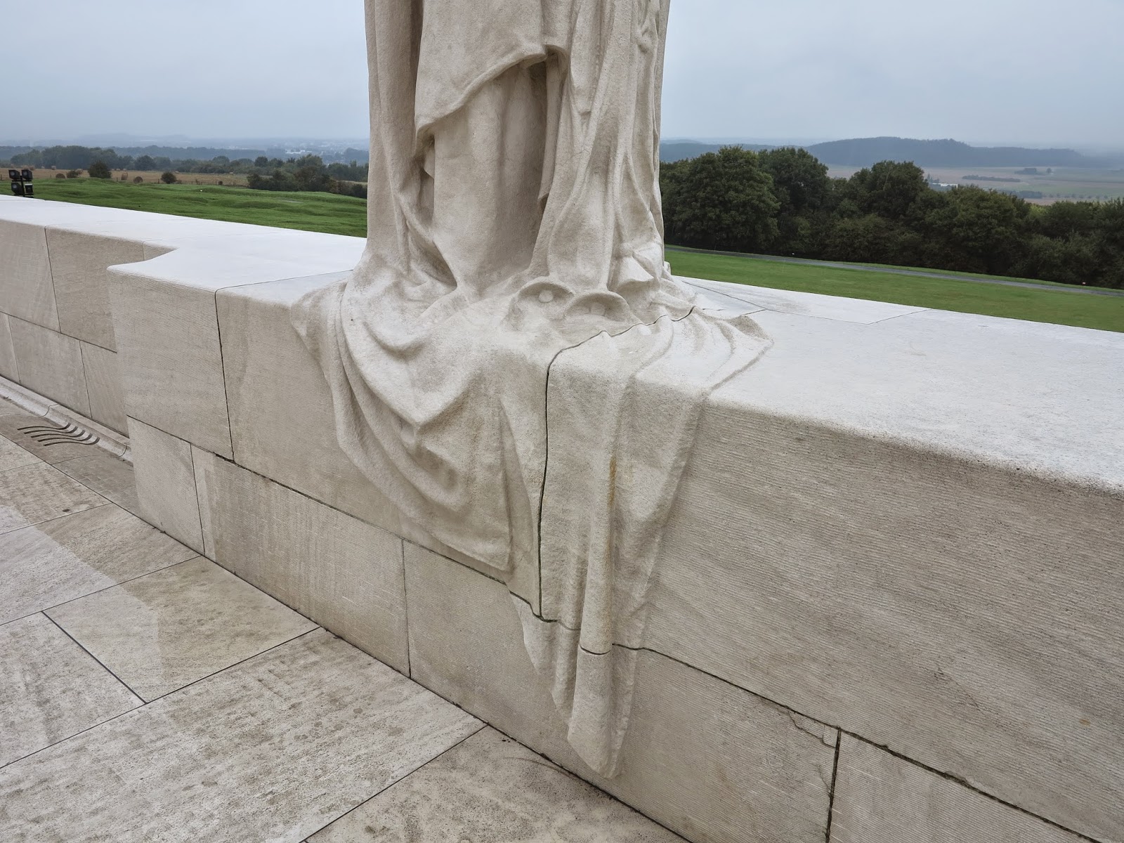
The Canadian memorial at Vimy Ridge, designed by Walter Seymour Allward, is mentioned less often (and harder to convey in an amateur photograph) but it is more prominent and better sited, and arguably as great a work of memorial design.  This memorial and Lutyens’ at Thiepval share one of the qualities often found in the greatest works of art: strangeness.   Neither is really quite like anything else.


It is harder – it seems – to do memorials well today.  Commissions exist, but most designers lack the skill or the will, and the mood of the times may be different.   Maya Lin’s 1982 Vietnam memorial at Washington DC shares the power of the best of the First World War memorials but done with a modernist, more abstract sensibility, and is also popular; but it seems to be harder to reach these heights as the years go by, as evidenced, for example, by London's ludicrous ‘Animals in War’ memorial in Park Lane (inscribed, mawkishly, ‘they had no choice’ – true, but what about the human conscripts?).

In an age when the ephemeral and the pop-up seem to reflect uncertain times, it is good to be reminded by the memorials of Lutyens and his generation of the virtues of solidity and permanence in design – and artistic quality.  If a monument has that quality – as we can see from all chapters of architectural histories, starting at the beginning - then it will last beyond the time when its purpose and those it commemorates have been forgotten – ars longa vita brevis. 


Tuesday, 4 November 2014

London's skyline debate - lessons from New York


A trip to New York last month to meet fellow professionals was a fascinating chance to find out about attitudes to tall buildings in their spiritual home. 

What was surprising, perhaps, was the extent to which most of the questions raised by tall buildings in London are also debated in similar terms over there (as are other questions such as how to provide 'affordable' housing for the less well off; and how to provide affordable housing, not in quotation marks, for middle income groups).

NY's Muncipal Arts Society's Accidental Skyline report concerns the effects of a wave of very slender, very tall new towers under construction and planned, mostly near Central Park, which will change the views from the park dramatically, and, the report suggests, overshadow it unacceptably.  Generally these new towers are as built 'as of right', the planning parameters - including the transfer of developable area from one site to another to allow ever taller and thinner towers - being established by the zoning system.  There are opponents of tall buildings over there as there are over here - but there is no way to prevent the schemes being built.  There as here, the fact that the accommodation is for the super-rich seems to exacerbate the opposition.  One example, 432 Park Avenue, designed by Rafael Vinoly of Walkie-Talkie fame, is under construction and appears to have reached its full height (that is the whole tower in the photo below, not just the lift and stair core) - and there was plenty of unfavourable comment from New Yorkers that we met. To build a tower in one world city that no one seems to like, though, may be regarded as unfortunate - to be responsible for two...


I didn't entirely buy the objections - it's no more out of scale with its surroundings than the Empire State building, and there are far worse architects than Vinoly - but the objectors may have a point about the cumulative effect of the many towers that are planned.  

The quality of new architecture over there varies from terrific to dire, just like in London. And just as in London, one can't help feeling that at least part of the opposition to new tall buildings is because many of them are not much good - although New York, perhaps because of the discipline of the grid, has not suffered quite as much as we have from the Architecture of Funny Shapes.  And unlike us, they have world class and world famous exemplars that they are proud of, from the Woolworth Building to the Seagram Building, to compare the new ones with.  

One of those, the Rockefeller Centre, may just fail to make the cut of world class architecture, but it represents world class urban design, and that - together with the fact that you can now admire the city from its top level - is undoubtedly one reason why it remains popular.  Recent attempts to do 'towers as placemaking', such as the planned Hudson Yards development, struggle to add up to more than the sum of their parts, and fail to come anywhere near the coherence and quality of the Rockefeller Centre.  


It was a surprise to me to learn that there is at least one protected view in New York. Their approach is different from ours, though, and arguably more sensible.   The  Brooklyn Heights Promenade, laid out in the 1940s for pedestrians at an elevated level above the Brooklyn Queens Expressway which runs along the shoreline, has views out across the water towards Manhattan and the Statue of Liberty.  The protected view - put in place when the promenade was built - controls development of the land immediately in front it at the lower level next to the water - now being laid out as the Brooklyn Bridge Park.  The protected view doesn't affect the way Manhattan on the other side of the water can develop, but it ensures you will still be able to see it from a place that was designed to take advantage of a view.  Protecting foreground rather than background was the original idea of protected views in London too, but as so often with UK planning, there has been mission creep.